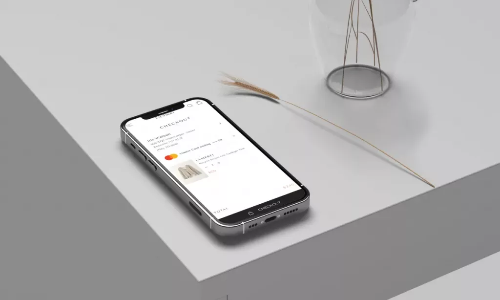
Customers want assurances of their privacy and security at all stages of an online purchase, especially during mobile checkout. In addition, shoppers want to see the shipping details of their purchases without unnecessary hassle. In short, this means buyers want an easy purchasing process without divulging too much of their personal information yet still be provided with the necessary details of their package.
When you can offer your customers this kind of experience, they will stay loyal to your company. On your end, this is how you succeed at building consumer trust and retention.
This blog will go over best practices for mobile checkouts to help you overcome buyer objections and create a frictionless shopping experience.
The Ideal Mobile Checkout Conversion Rate
A recent study found that the average mobile conversion rate for e-commerce is 1.1%. It may appear insignificant, but it adds up when there is a high traffic volume. Even the top 20% of stores convert at a rate of 2.7%, and 3.9% puts you in the top 10% of brands.
Mobile Checkout Best Practices
Highlight the checkout button
Customers should not abandon their carts due to a lack of visibility of the checkout button. The design does not need to be flashy, with bright colours and a glittery 1990s backdrop, but it must be visible.
Highlighting the checkout button can be accomplished by using brand colours or floating buttons. Most importantly, you must keep the shopping cart button visible at all times.
Allow guest checkouts
Nobody wants to give you all of their personal information, especially if it’s the first time doing business together. Allow customers to use a guest mobile checkout option, which requires only their email address for order confirmation and their shipping address for product delivery.
Allow online shopping transactions via Google or social media
Customers should be able to check out by logging in with their social media or Google accounts. This cross-platform sign-in allows customers to access previous purchases without filling out redundant forms.
Keep things simple.
You want to keep the shopper’s attention on the “buy” and “checkout” buttons. Remove unnecessary information and clutter, and leave enough white space between text and images. This design choice will direct all buyer focus to the parts of the page that lead to more conversions through mobile checkout.
Be precise
Unexpected fees are a customer’s worst nightmare. Be upfront and honest about fees instead of shocking (and appalling) customers with exorbitant delivery fees. Making this change will improve your customer experience.
Give assurance
Online shopping is risky due to the danger of purchasing from a scam. Many first-time online shoppers are wary of providing credit card information to unknown brands. Thus, assure customers with your safety badges and link to your social media accounts.
Provide multiple in-app payment methods
Offering customers convenient payment options such as Apple Pay, PayPal, and Klarna will increase sales. Offering more ways to pay will help buyers make purchases without leaving your app.
Make use of autofill
Slowing down a frantic shopper can work against you in terms of sales. You should focus on capturing people who are ready to buy.
Use a plugin that automatically fills in critical information such as your address and email address. Fewer touchpoints mean less hesitation and less time for a customer to complete a transaction.
Confirm the order
If you do not send an order confirmation, customers may lose faith in you. Keep in mind that they have just paid you with their hard-earned money, and you must demonstrate it for them to remain loyal to your brand.
You can also create a “thank you” page that customers see after completing an e-commerce checkout.
Update customers on delivery details
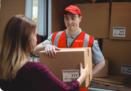
Maintain contact with your customers until their orders have arrived successfully. Send them emails regularly, allow them to track their orders through your mobile e-commerce site, and keep them informed to avoid panic. This strategy also reduces the number of “where is my product?” customer service tickets. It’s a win-win situation for all parties.
Conclusion
Running a successful e-commerce business is anyone’s dream in this digital age. If you run one of these businesses, your checkout problems could be gone simply by keeping these best practices in mind. Whether you’re a business owner or a customer (or both), there’s no denying that seamless mobile checkouts could help your company grow. Plus, it will always increase your buyer’s satisfaction!
Flashbox is the industry’s premier business offering same-day delivery solutions services. Talk with one of our delivery experts today about your delivery needs.


